Type specimen book: Metro Perspective
Layout design
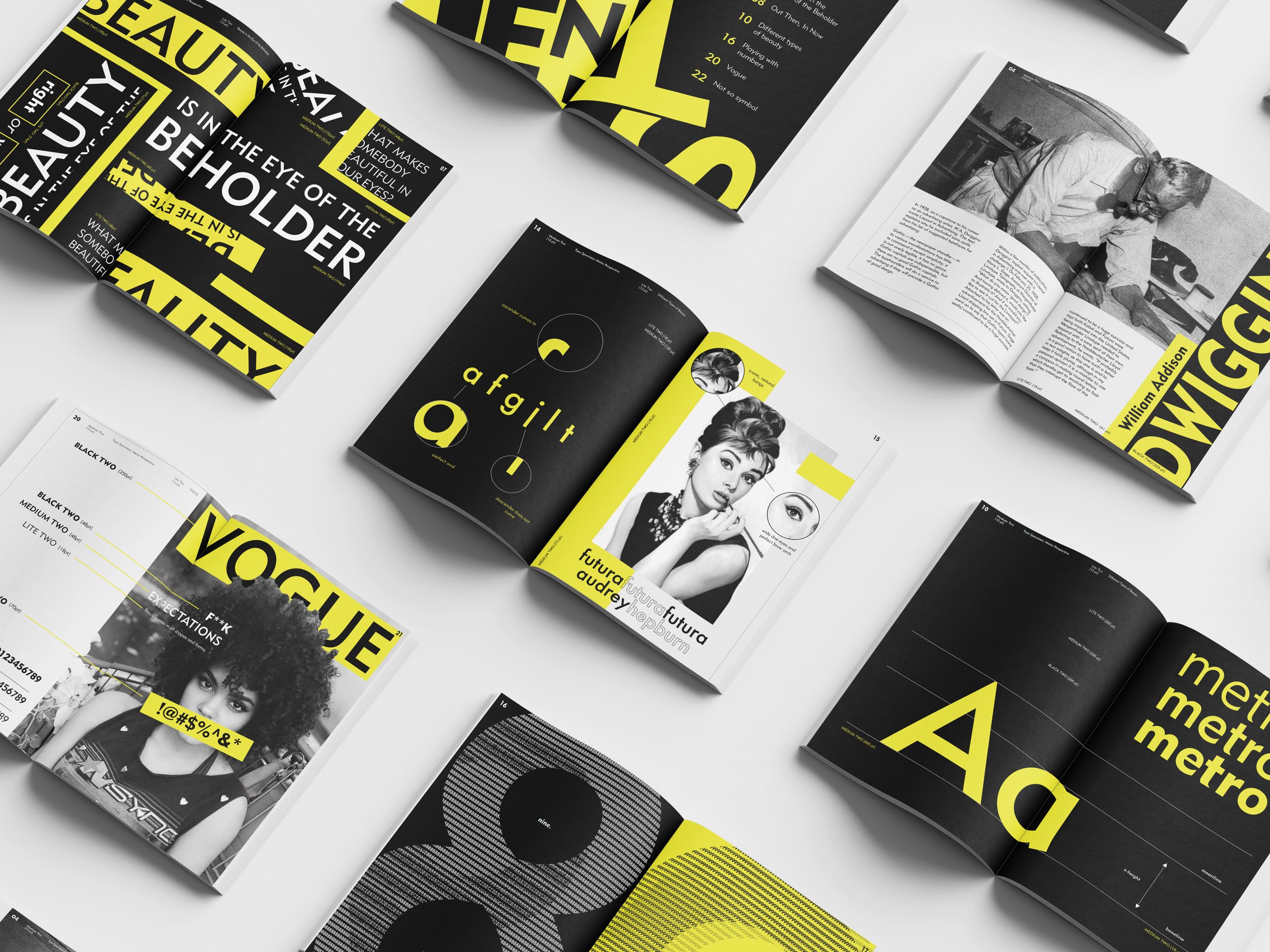
Project Overview
Typography plays a major role in graphic design as each typeface contain different qualities that may help strengthen ideas that are being communicated. To successfully understand a typeface, you must not only understand its anatomy, but also be familiarized with the designer and current events that happened during the time period that it was created. The goal for this project is to pair a font family with a personal subject of interest. It is not only important to find a topic that parallels my research, but it is also important to also take risks.
How Metro Came to Be
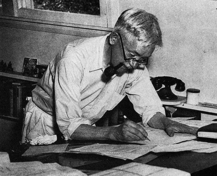
Metro was designed by advertising artist, W.A Dwiggins based on what was almost a dare. After releasing an article where he explains why gothic fonts should not be used for advertisement, he receives a response from Harry L. Gage, the Assistant Director of Linotype Typography, who points out successful sans serif fonts such as Futura, Kabel, and Gill Sans. With Gage by his side, Dwiggins was able to create a new typeface that was unique in the sense that it was more plump compared to existing gothic typefaces. He also created it without using a compass, as he believed that using one would ruin the flow of rounded shapes.
Creative Direction
After doing some research, I wanted to focus on the topic of how beauty is “in the eye of the beholder”. Beauty standards are controversial and some people may even change their appearance to meet the expectations of others. Dwiggins created Metro by altering what he believed were the flaws of other typefaces and “perfecting” them. I approached this project by digging into the “rights” and “wrongs” of the world as well the evolution of beauty standards over time.
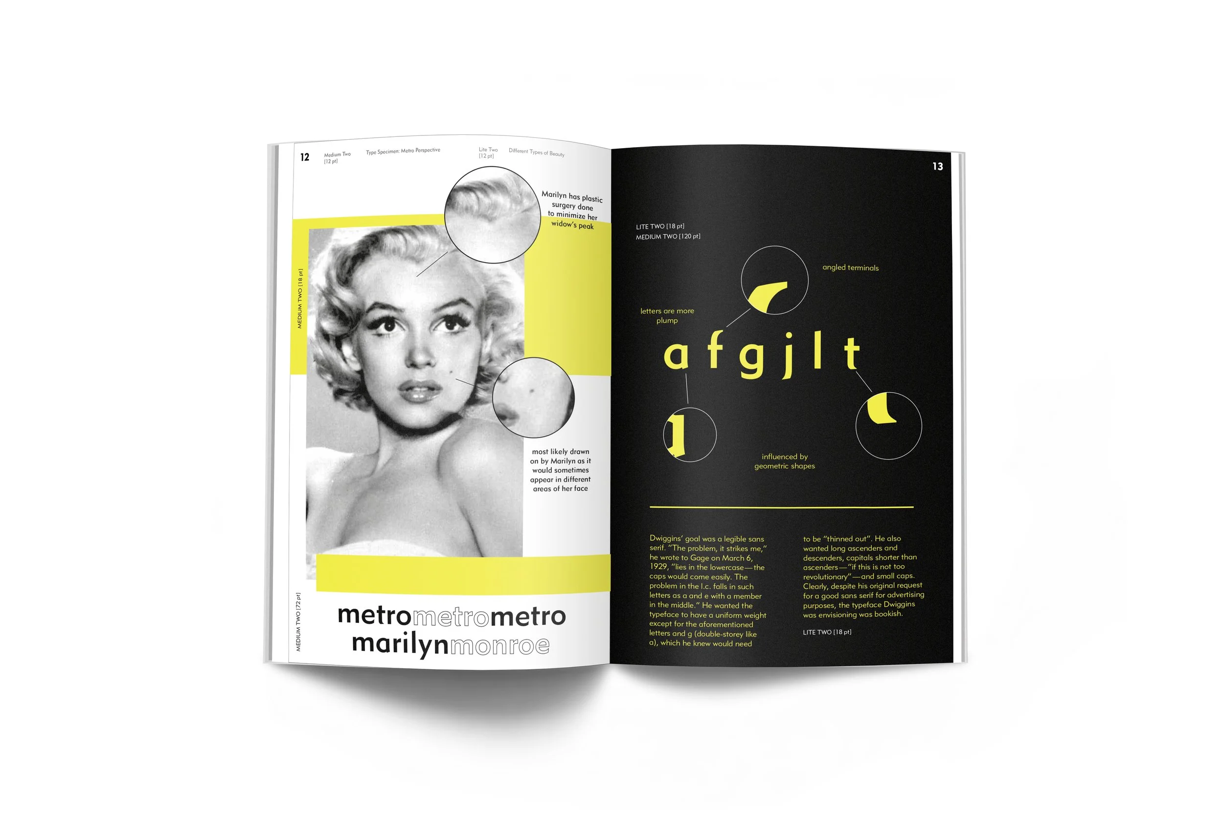
Marilyn Monroe & Audrey Hepburn
For my type anatomy, I included callouts for certain letterforms for not only Metro, but Futura as well. Dwiggins actually used Futura as a reference while creating Metro which was why I wanted to focus on their differences. By incorporating iconic figures such as Marilyn Monroe, I was able demonstrate the parallels of beauty standards in people and typefaces. I associated Marilyn Monroe with Metro because she was known to have done some plastic surgery in her life, such as on her forehead to minimize her widow’s peak. She also used to cover her beauty mark due to insecurities and it is also said that she would draw it on at different spots. I viewed Metro as the “plastic surgery” version of futura. I used Audrey Hepburn as a representation of Futura since she had never gotten any work done on her face and many people admire her for her natural features.
