LA KINGS
Social Media Concepts
Project Brief
Being one of the biggest, most valuable franchise in the NHL, the LA Kings carry around a strong brand identity they’ve made unique to themselves. With the team’s rapid growth and the strong chokehold social media has on today’s generation, we must utilize platforms such as Instagram, X, Facebook, and TikTok not only as a marketing tool but to build and strengthen the relationship between the players and their fans by allowing them to enter the world of the Kings’ players through birthday posts, player highlights, and snippets from their everyday lives. The goal is to do this while keeping an aesthetic look, incorporating strict brand guidelines, and keeping consistency while also templatizing layouts for quick turnaround times and mass production.
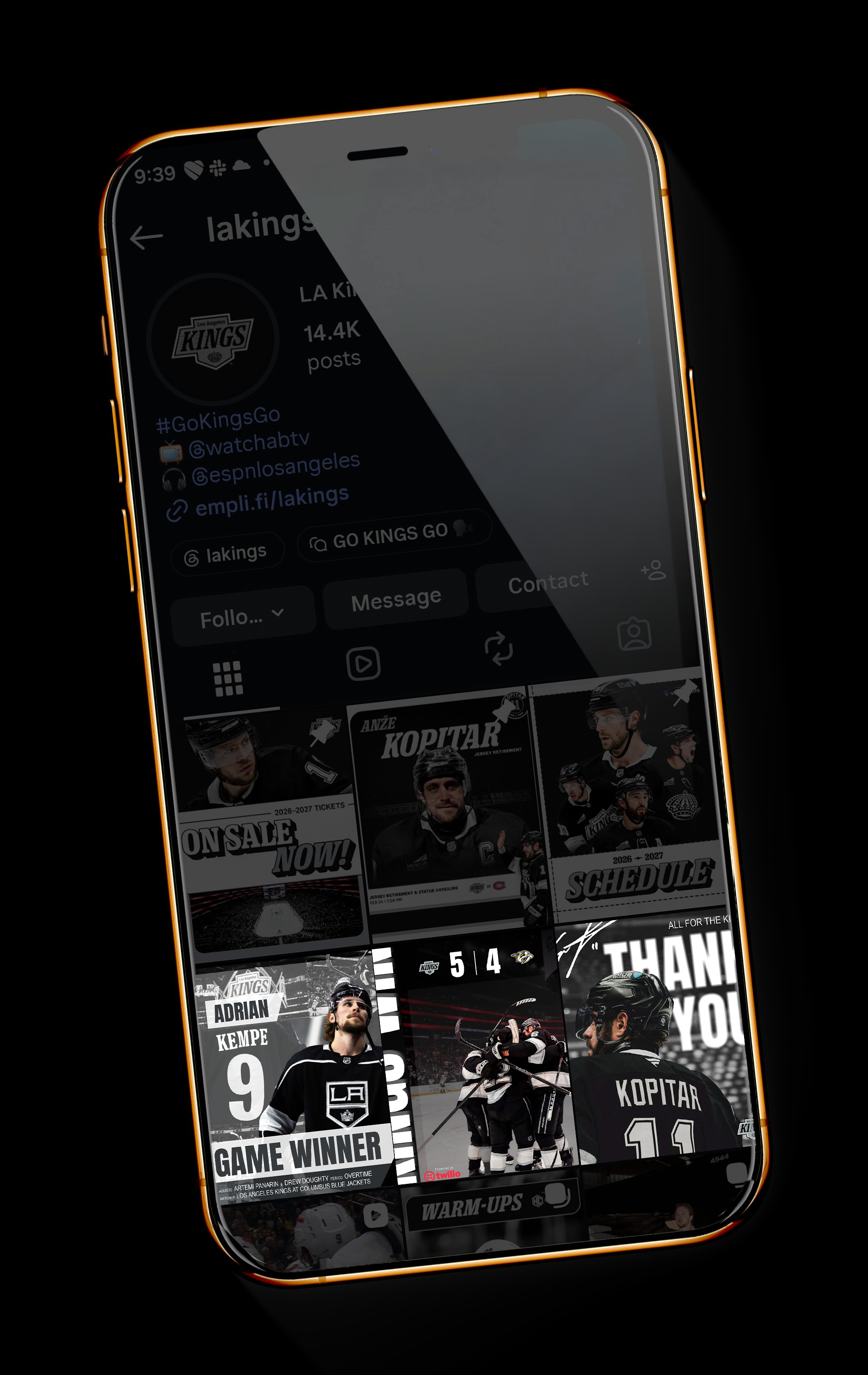
Disclaimer: Due to the fact that I do not have access to the LA Kings’ licensed font, I chose to go with something similar
Consistency & Brand Identity
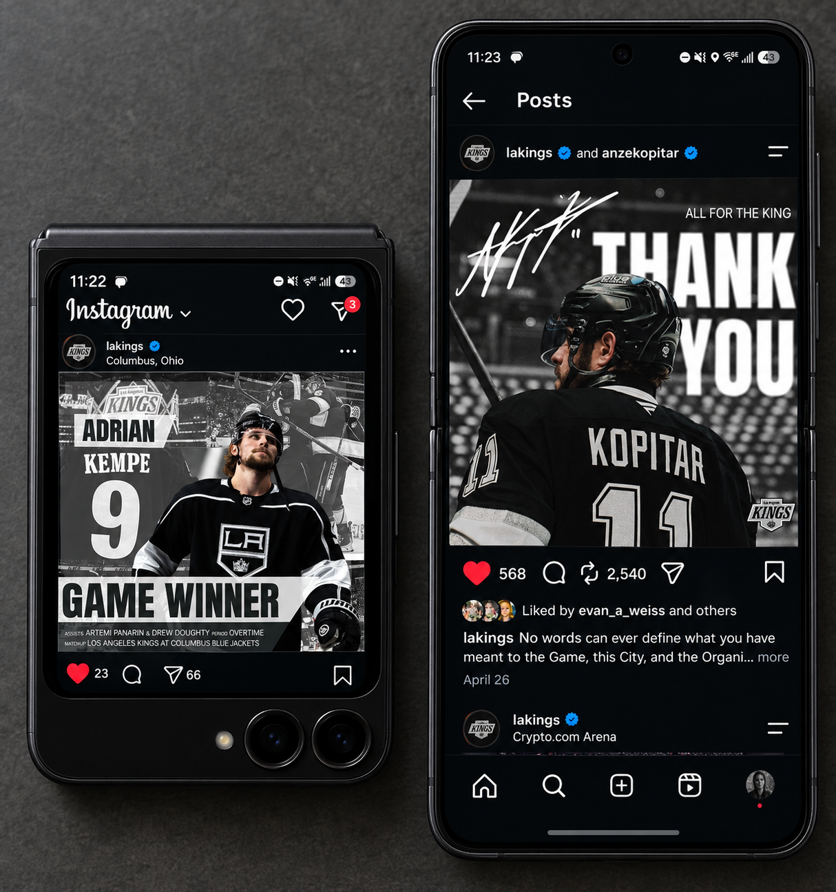
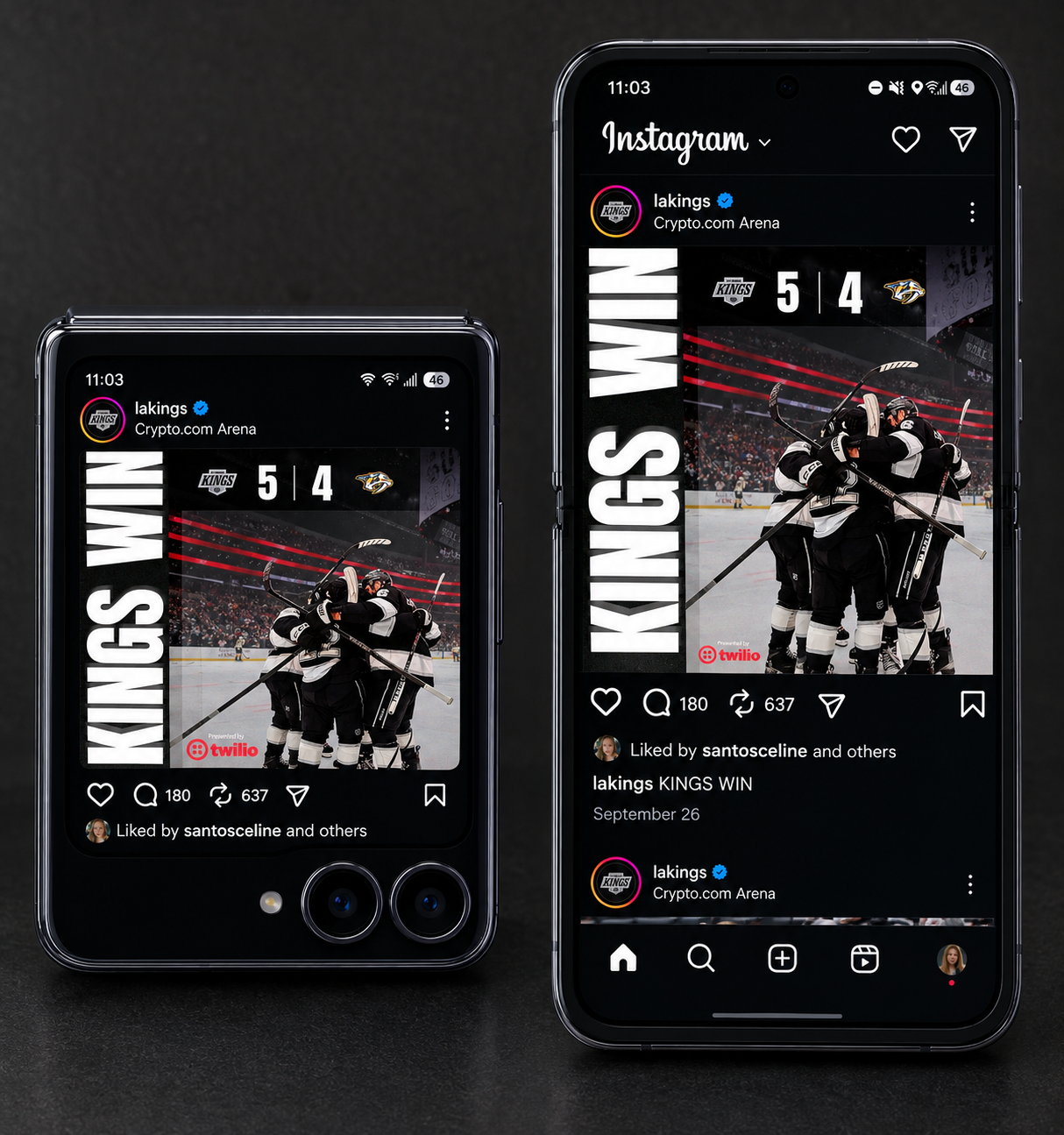
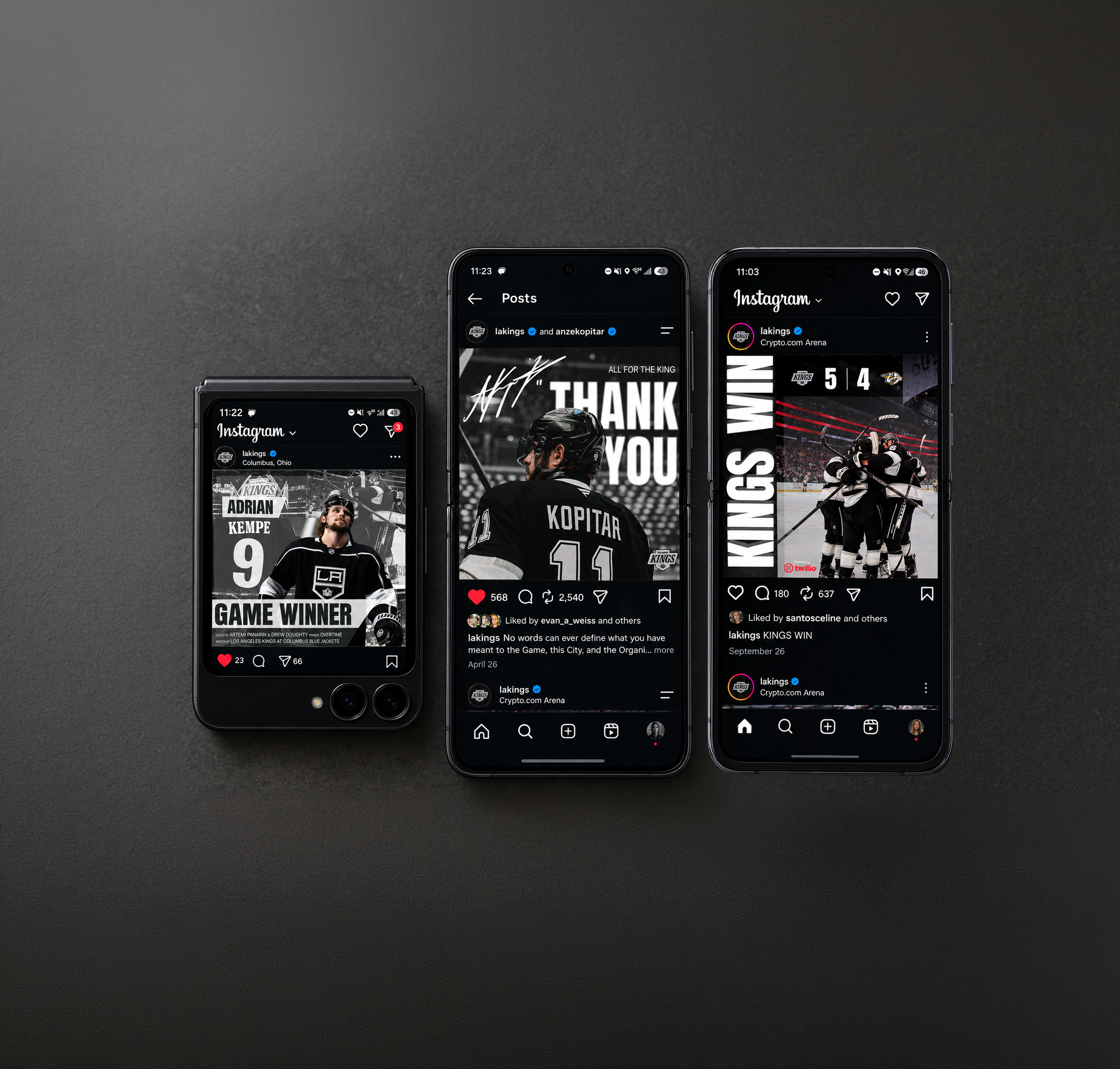
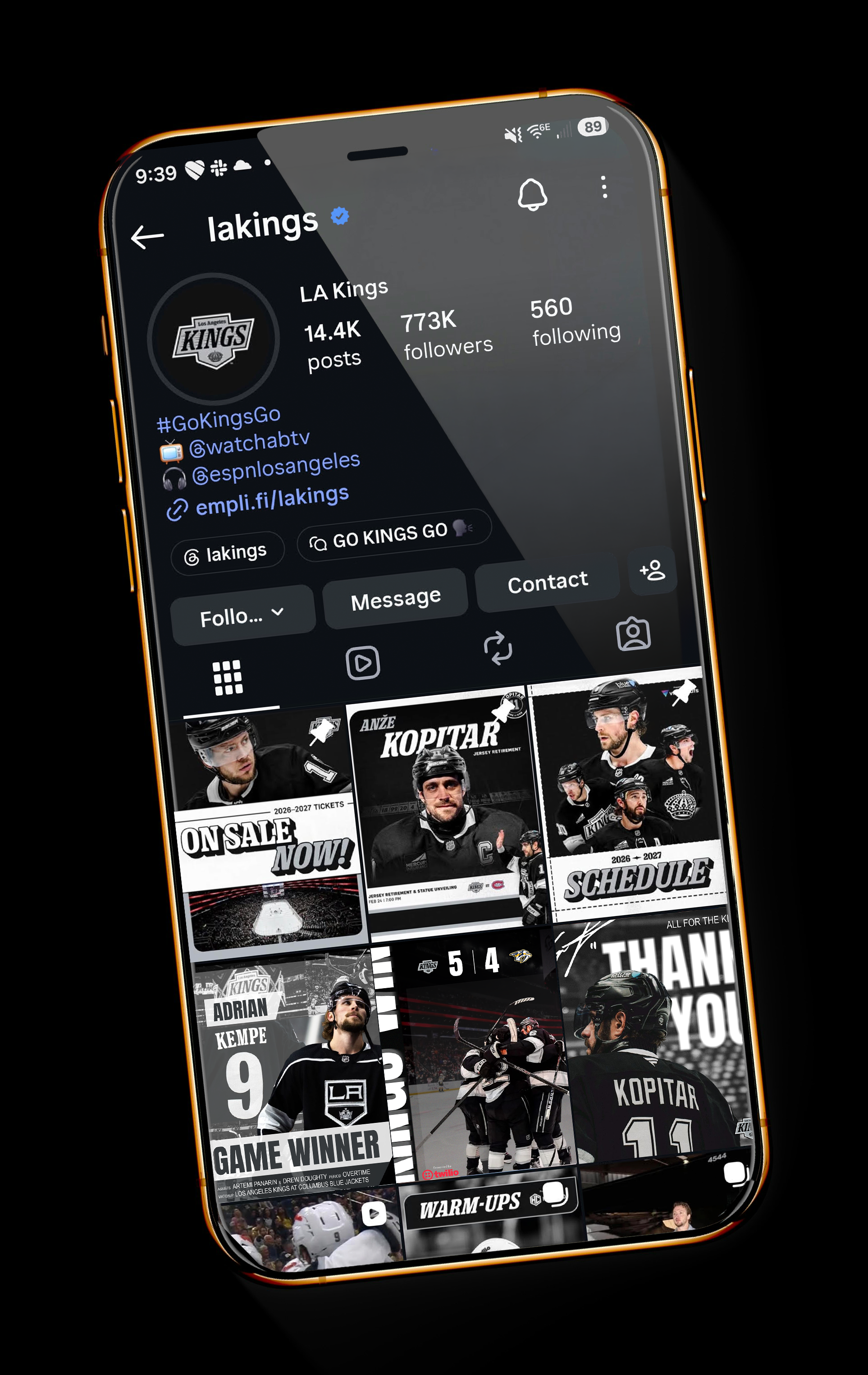
To the left are three social media posts I’ve created and implemented into the LA King’s existing instagram page to demonstrate what a user would see.
Black. Silver. White.
Those are the team’s three primary colors so it’s important to keep that monochromatic look across the page while also highlighting the players and using bold, dynamic text so that it builds hierarchy, catches the viewer’s attention, and easy to digest. This is especially important since social media is supposed to stand out at first glance.
What’s also important is utilizing graphic elements such as the white blocks to not only build contrast for the copy but it also breaks up the composition which goes back to the importance of hierarchy.